A2 Media Blog
Wednesday, 16 May 2012
Evaluation
In what ways does your media product use, develop or challenge forms and conventions of real media products?
There are a few features of our music video that challenge the forms and conventions of general media products. Such as the 60's feel we threw in which we feel contrasts well with the black and white theme. In the majority of Adele's music videos, you can notice that she stars alone in a lot of them. This convention has worked well for Adele, so we wanted to match that but add a little twist into it to make it our own and challenge the forms and conventions of real media products.
How effective is the combination of your main product and ancillary texts?
The genre on the whole is effective due to the codes and conventions such as being bold, classic and retro. This makes it a brand of its own due to the codes and conventions the genre holds. The theme throughout the music video is effective, the combination of our main product and ancillary texts is the way the whole media product combines together with the use of mise en scene and how this contrasts with the theme of the 60's.
What have you learned from your audience feedback?
We have learned a great deal from our audience feedback. We learnt that the contrast of our video and the twist we put in went really well and the uniqueness of our media product stood out. We also learnt that a one of our contrasts didn't work aswell as we though it would, as one of our audience members pointed out that our use of a rolled up cigerette and a Chloe drinking a cocktail at a bar didn't connect to well which we understood. But the main reason we did this was because the video was based in the sixties which many people smoked in that decade as they didn't know it was bad for them. Other than that we did learn from it and now know we should pay more attention to better contrasts.
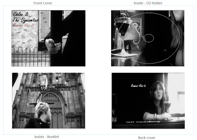
Finished Digipak & Album Advert
I completely transformed the digi pack and made it bold, eye catching and unique. by using some screen shots from our actual music video on my digi pack, so it comes accross more involved in the actual video it's self.
By keeping the images in black and white and using simple font, it really draws focus to 'Chloe' which is a great audience eye catcher and really stands out in the crowd.
Props
We used certain props to increase the realism and over all mise en scene.
We decided to use a cocktail to convey that Chloe in the music video was of high class, as cocktails are often perceived as a high class drink in comparison to a 'beer' for e.g.
We also decided to use a 'pebble stone wall' prop in one of our scenes also to add to the whole cinemaphotography of the 60's theme, we thought it fit in very well with the rest of the footage for our music video and was a unique factor which adds to bettering our final piece.
By using a typical 60's trend, a 'rolled cigerette' we thought would be a superb prop to use to bring out the whole 60's feel and really had an authentic take on the whole shot. With the shot being in black and white aswell, this only adds to the realism.
Costume and Make up
We thought it would be best to put Chloe in a traditional 60's outfit. The costume is very important to bring the mise en scene up to standard.
By using a deep blue duffel coat as Chloe's main factor of costume, this only builds on the authentic 60's look.
We added in 60's style rings to complete the outfit. We kept the outfit clean, neat and simple. We did this to draw attension to other sections in the music video, such as Chloe's face.
With the make up prospects, that was left up to the other two girls in the team as they know a bit more. But after discussing the make up we decided that it is best to keep it toned down and simple as the look on the whole was quite simple.
Similar to this style of 'Twiggy' back in the 60's, we mainly concentrated on shades rather than colours considering the whole music video is in black and white.
Locations
The locations we used, we tried to keep as vintage and meaningfull as possible.
For e.g we used a church, graveyard because we wanted to subvert from futurism or any kind of distracting background that takes away the lime light from Chloe.
For e.g we used a church, graveyard because we wanted to subvert from futurism or any kind of distracting background that takes away the lime light from Chloe.
This location is very important, mainly because it brings out true British roots via the famous 'red telephone box'. It's vibrant and bold and represents the 60's.
This is also a very important location as it represents Chloe as being young, vibrant and social. By using a cocktail bar with a 60's style poster in the back fit in perfectly with the 60's theme we wanted to portray.
Drafts of Digipak & Album Advert
After looking closely into album artwork and gathering some ideas I decided it would be best to scrap my draft of my digi pack and go for something different and slightly unique.
Subscribe to:
Comments (Atom)


